

VIE, AUT • 48.2179° N, 16.4033° W
Game Season
Revitalizing User Experience: A Case Study on the Web Design Transformation of a CD-Key E-commerce Platform
Completion
2013 - 2023
Industry
Game Season
Tools
Figma
Services
Website design
The Challenge
{
}
Revitalizing a decade-old design by incorporating new design trends and addressing current user experience requirements.
01
solution
{
}
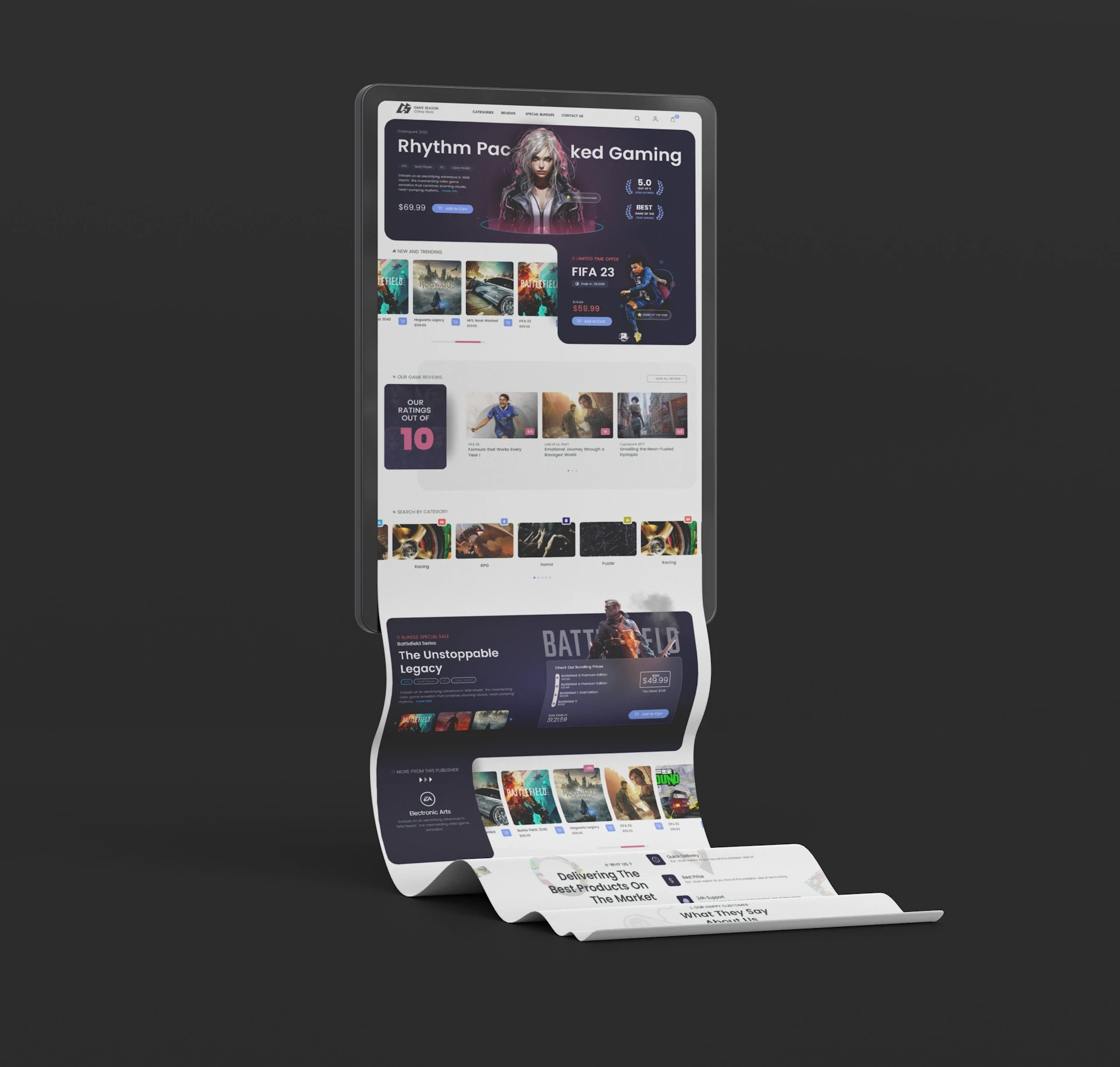
Crafting a design that seamlessly integrates new trends, caters to user experience demands, and preserves the inherent structure of the original design.
Original Design Analysis
{
}
Evaluating the strengths and weaknesses of the original design to show how the new one has been improved
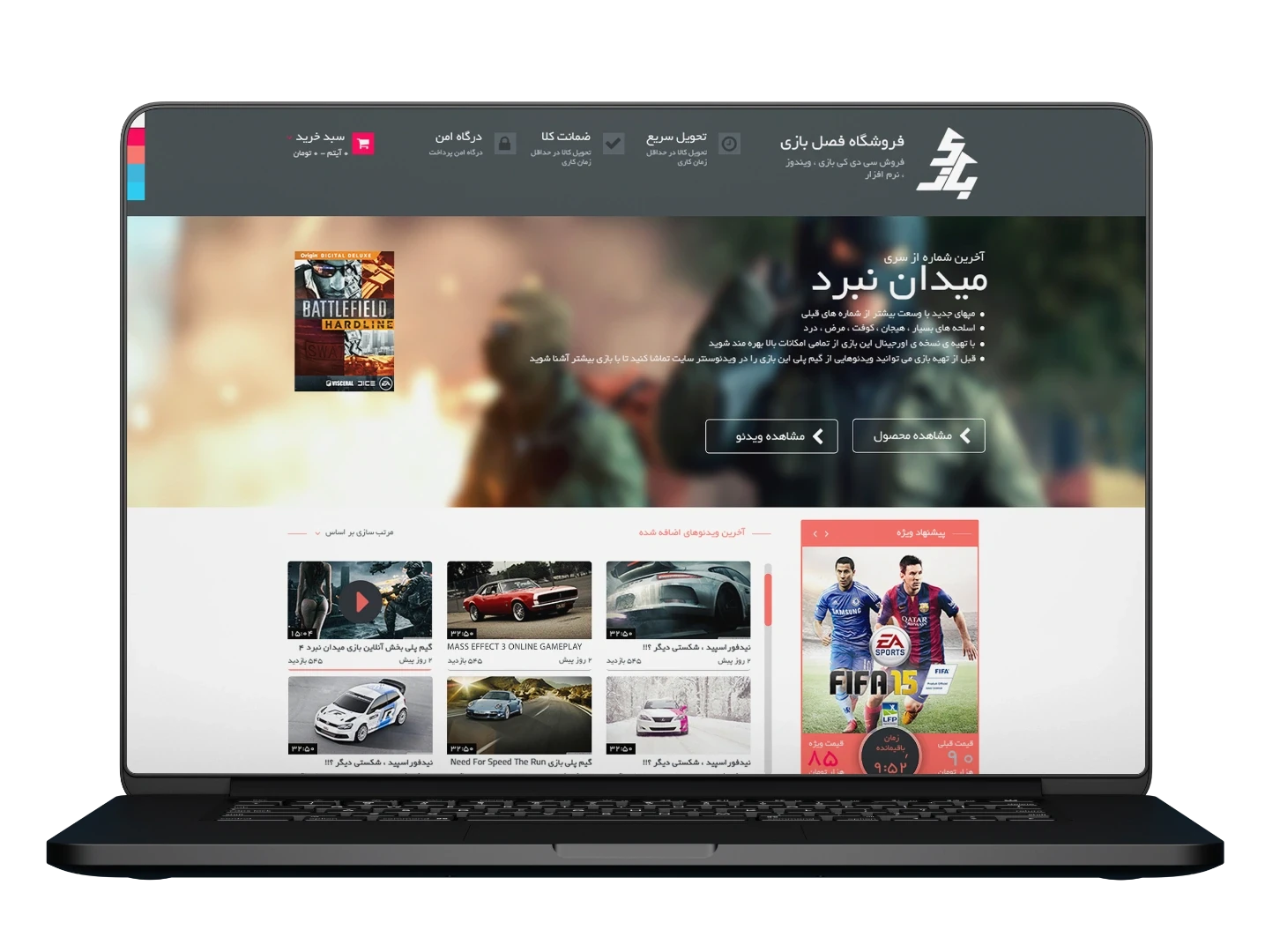
1. Lack of Iconography in Menus and Navigations (register / login). 2. Insufficient Information in the Main Hero Section. 3. Inclusion of a Featured Video section in the Above the Fold. 4. Unclear User Path in the Promotion Box.
Wireframe: OLD VS. NEW
{
}
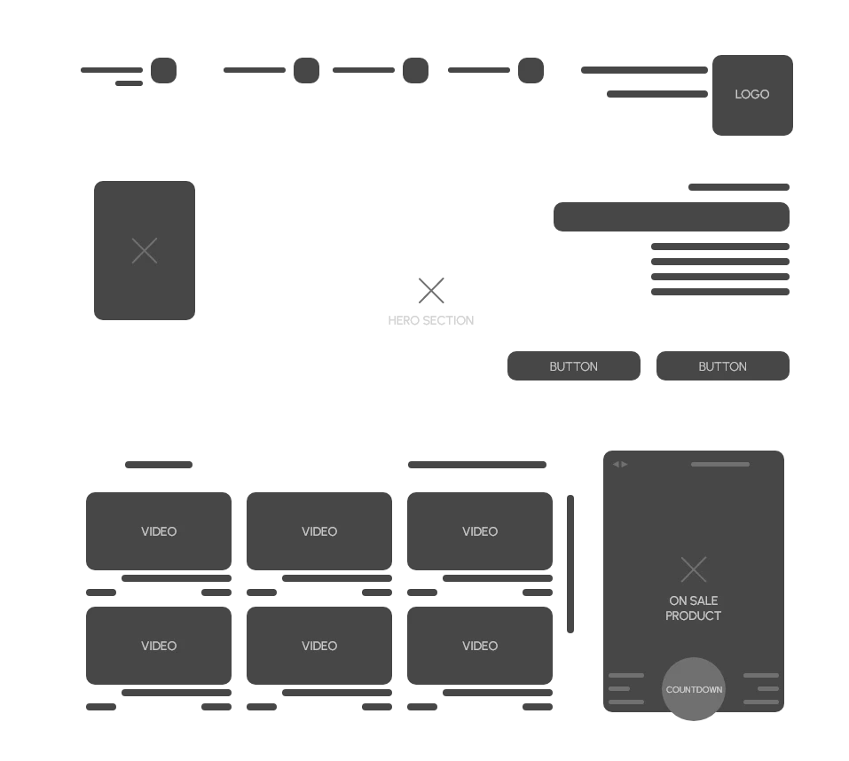
When contrasting the wireframes of the old and new designs, a notable distinction lies in the directional orientation—Old design follows a right-to-left (RTL) flow, while the new one adopts a left-to-right (LTR) approach. Despite this directional shift, the overarching structure has persevered, maintaining a consistent framework.
re-Design Enhancements
{
}
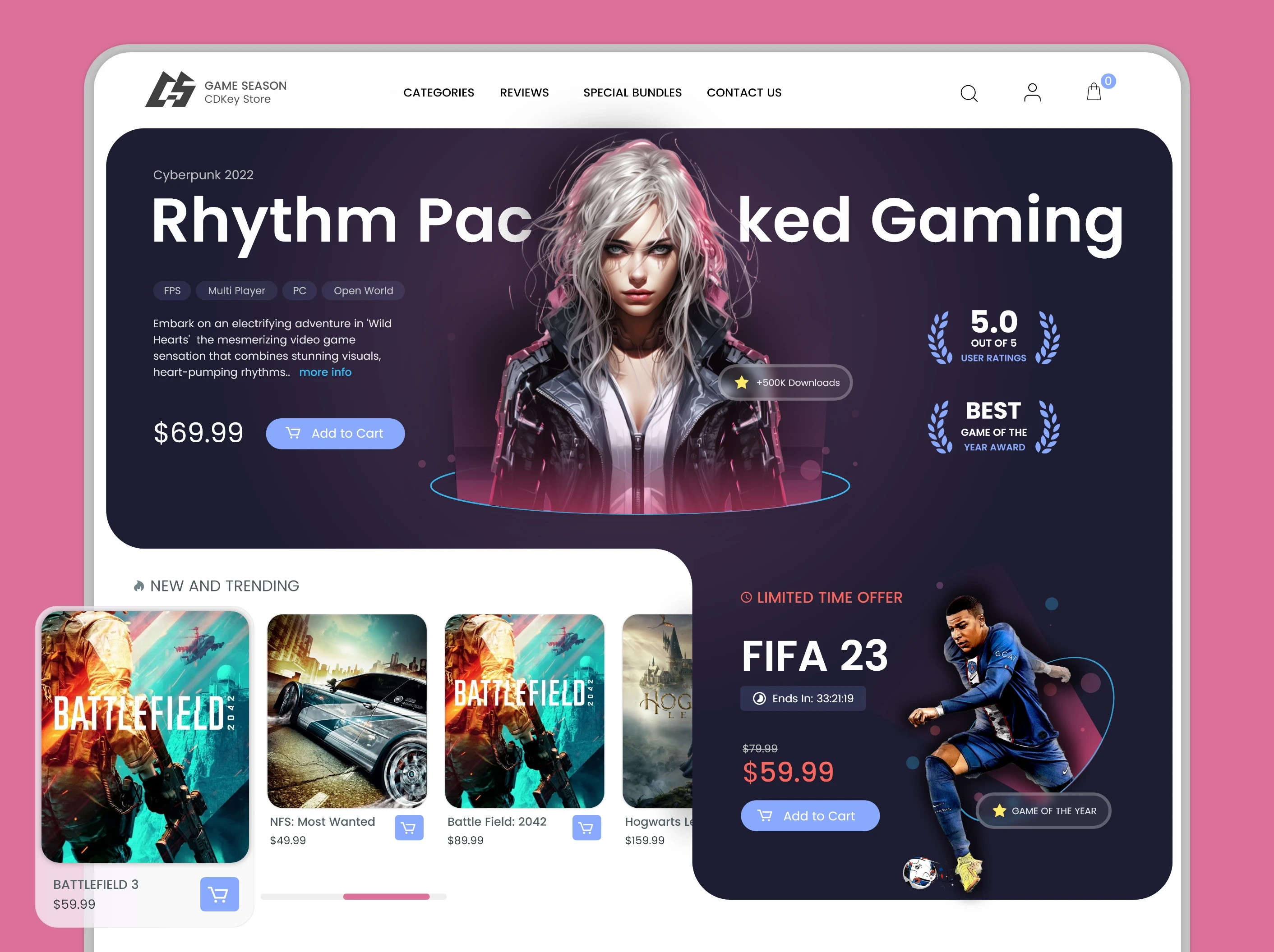
1. Utilization of bento grid style for neat content organization 2. Streamlined user journey for product selection and cart interaction 3. Thoughtful integration of icons for search, registration, and cart 4. Elegant and readable design with attention to typography
RESULT
{
}

Other projects
© 2023
Ali Aliakbar
VIE, AUT • 48.2179° N, 16.4033° W
Game Season
Revitalizing User Experience: A Case Study on the Web Design Transformation of a CD-Key E-commerce Platform

Completion
2013 - 2023
Industry
Game Season
Tools
Figma
Services
Website design
The Challenge
{
}
Revitalizing a decade-old design by incorporating new design trends and addressing current user experience requirements.
01
solution
{
}
Crafting a design that seamlessly integrates new trends, caters to user experience demands, and preserves the inherent structure of the original design.
Original Design Analysis
{
}
Evaluating the strengths and weaknesses of the original design to show how the new one has been improved
1. Lack of Iconography in Menus and Navigations (register / login). 2. Insufficient Information in the Main Hero Section. 3. Inclusion of a Featured Video section in the Above the Fold. 4. Unclear User Path in the Promotion Box.
Wireframe: OLD VS. NEW
{
}
When contrasting the wireframes of the old and new designs, a notable distinction lies in the directional orientation—Old design follows a right-to-left (RTL) flow, while the new one adopts a left-to-right (LTR) approach. Despite this directional shift, the overarching structure has persevered, maintaining a consistent framework.
re-Design Enhancements
{
}
1. Utilization of bento grid style for neat content organization 2. Streamlined user journey for product selection and cart interaction 3. Thoughtful integration of icons for search, registration, and cart 4. Elegant and readable design with attention to typography
RESULT
{
}

Other projects
© 2023
Ali Aliakbar
VIE, AUT • 48.2179° N, 16.4033° W
Game Season
Revitalizing User Experience: A Case Study on the Web Design Transformation of a CD-Key E-commerce Platform

Completion
2013 - 2023
Industry
Game Season
Tools
Figma
Services
Website design
The Challenge
{
}
Revitalizing a decade-old design by incorporating new design trends and addressing current user experience requirements.
01
solution
{
}
Crafting a design that seamlessly integrates new trends, caters to user experience demands, and preserves the inherent structure of the original design.
Original Design Analysis
{
}
Evaluating the strengths and weaknesses of the original design to show how the new one has been improved
1. Lack of Iconography in Menus and Navigations (register / login). 2. Insufficient Information in the Main Hero Section. 3. Inclusion of a Featured Video section in the Above the Fold. 4. Unclear User Path in the Promotion Box.
Wireframe: OLD VS. NEW
{
}
When contrasting the wireframes of the old and new designs, a notable distinction lies in the directional orientation—Old design follows a right-to-left (RTL) flow, while the new one adopts a left-to-right (LTR) approach. Despite this directional shift, the overarching structure has persevered, maintaining a consistent framework.
re-Design Enhancements
{
}
1. Utilization of bento grid style for neat content organization 2. Streamlined user journey for product selection and cart interaction 3. Thoughtful integration of icons for search, registration, and cart 4. Elegant and readable design with attention to typography
RESULT
{
}

Other projects

