

VIE, AUT • 48.2179° N, 16.4033° W
Food Notify
A Redesign Case Study for Foodnotify's startup
Completion
October 2023
Industry
Food Notify
Tools
Figma
Services
Website design
The Challenge
{
}
Strategic Redesign: Amplifying Company's Message and Visual Storytelling for Enhanced Communication
Original Design Analysis
{
}
Evaluating the strengths and weaknesses of the original design to show how the new one has been improved
Lack of Distinctive Branding
{
}
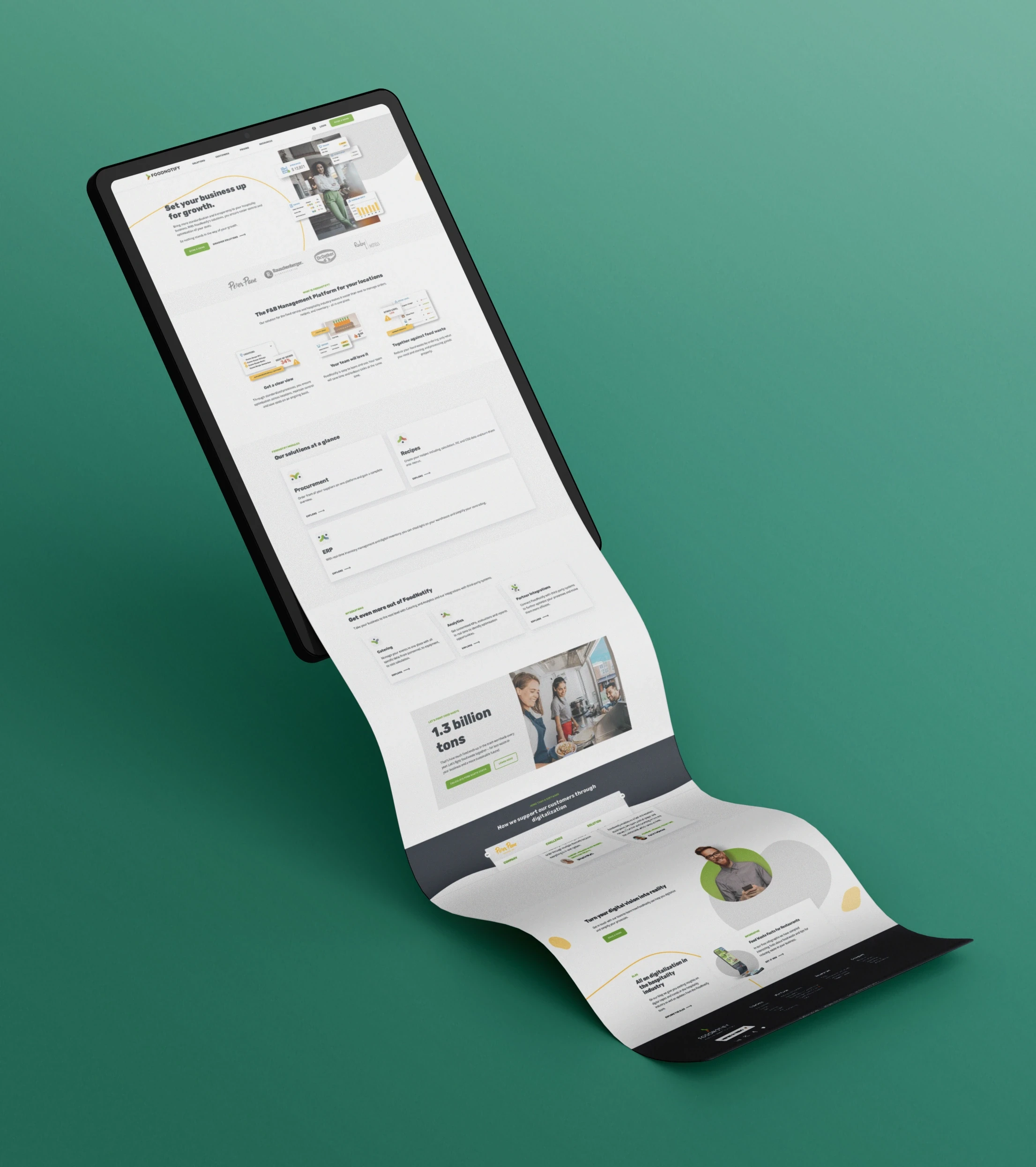
The current design lacks a discernible and consistent branding presence, resulting in a diluted representation of the company's identity. There is a need to establish a more distinctive and recognizable visual language that reinforces the brand across all design elements.
Muted Company Message
{
}
The core message of the company is muffled within the design, failing to resonate prominently with the audience. An urgent enhancement is required to amplify the clarity and resonance of the company's message, ensuring it becomes a focal point that leaves a lasting impression on visitors.
Generic Design
{
}
The design currently appears overly generic, neglecting to reflect the unique goals and aspirations of the company. To establish a more authentic connection with the audience, the redesign should encapsulate the essence of the company's mission, values, and aspirations, forging a more meaningful visual identity.
Excessive Design Real Estate
{
}
The design occupies an unnecessary amount of space, limiting the visibility of crucial information. A more judicious allocation of design elements can optimize the layout, freeing up space for essential content. This strategic adjustment ensures that key information takes center stage, providing a more impactful and informative user experience.
How to solve the problem
{
}
A Design Journey Toward Reflective Brand Identity and Purposeful Goals
improvements
{
}
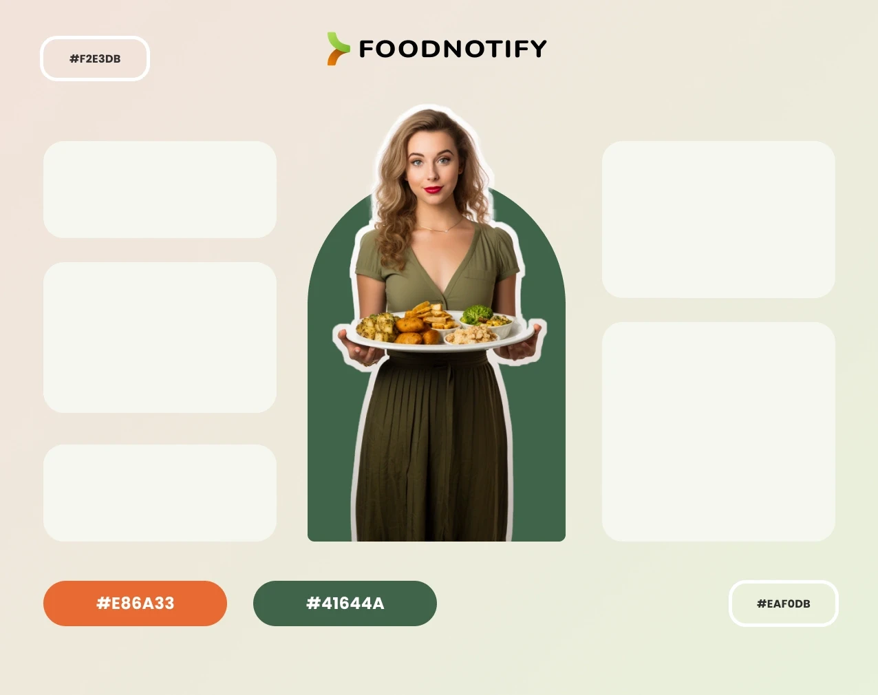
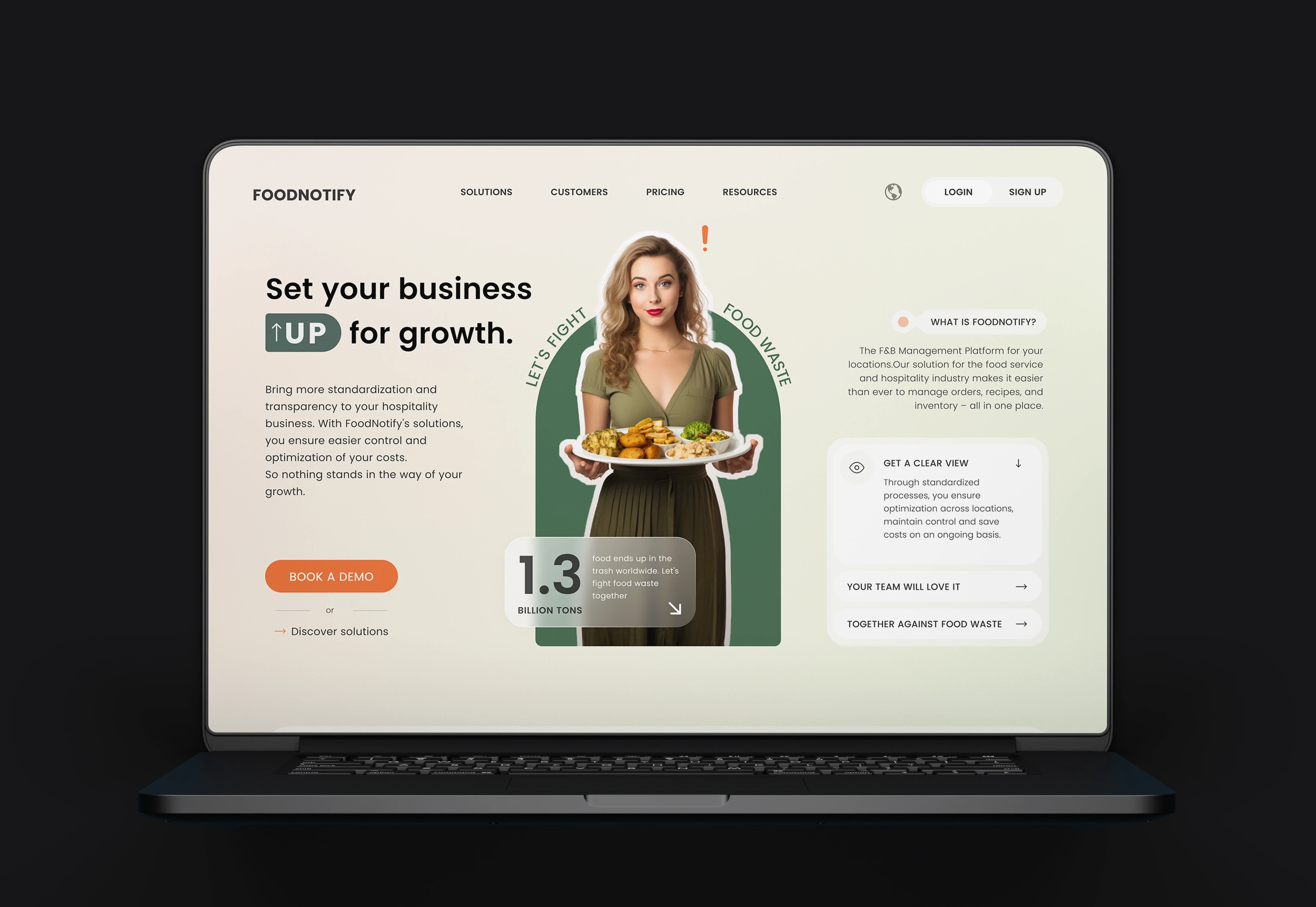
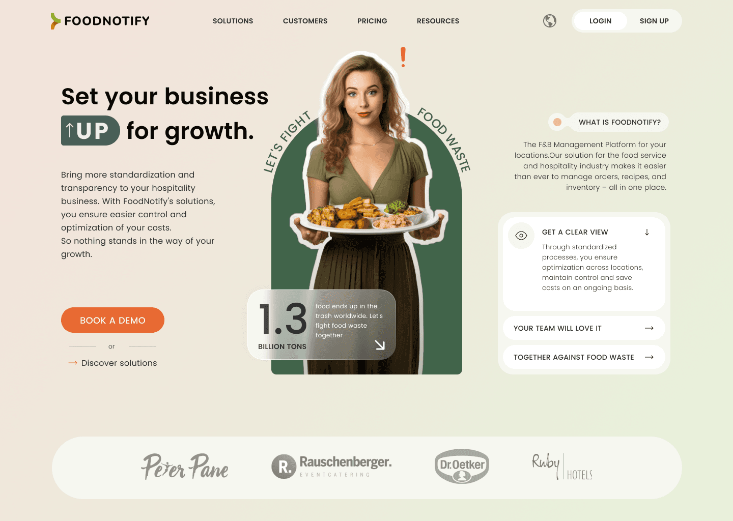
Clear Branding: Thoughtful use of elements and colors. Strategic Space Use: Echoing company goals in the above-the-fold section, addressing the main concern, solution, and importance. Relevant Graphics: Tailored visuals for the company's goals.
RESULT
{
}
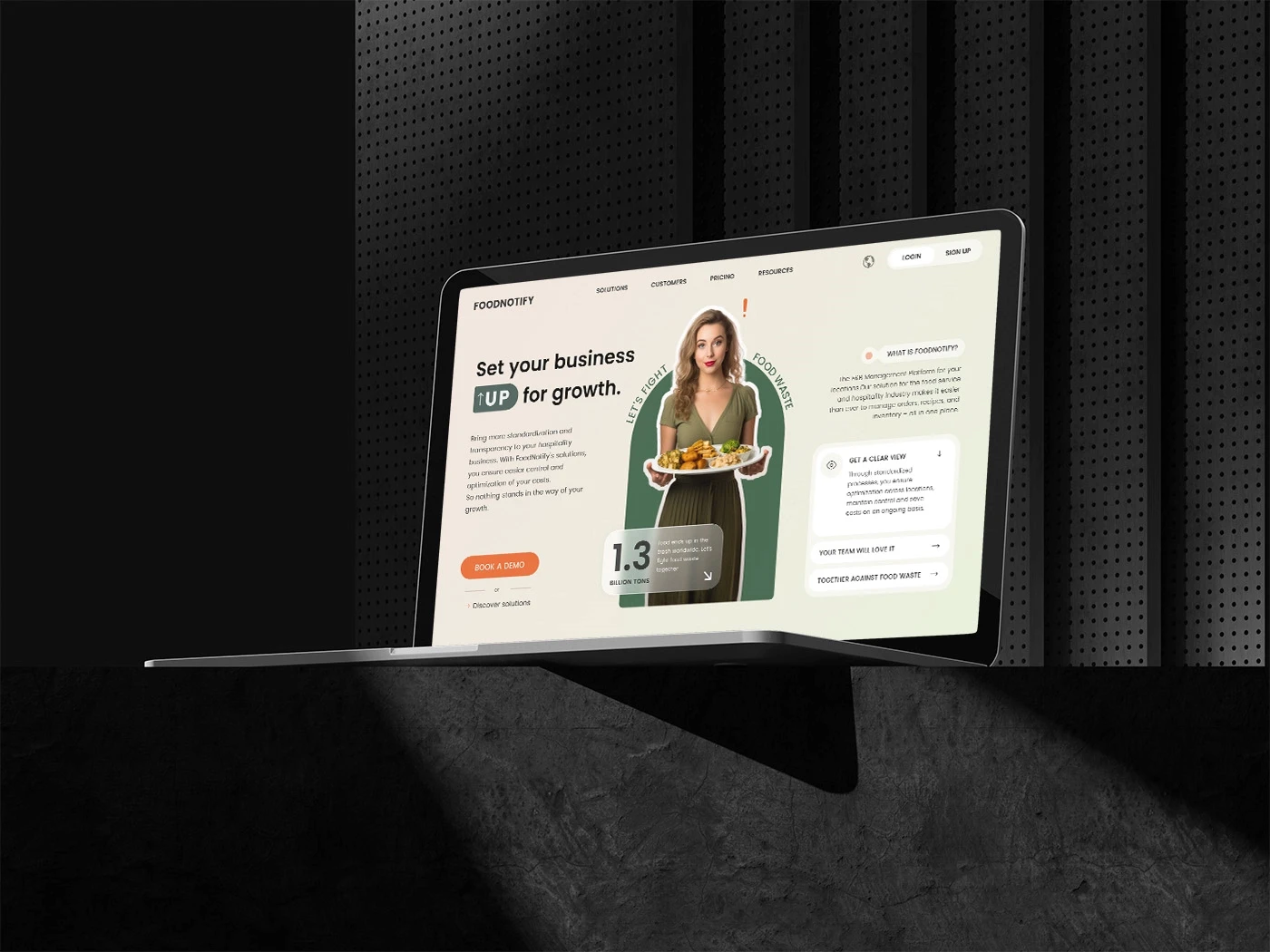
Only ' above the fold ' section
Other projects
© 2023
Ali Aliakbar
VIE, AUT • 48.2179° N, 16.4033° W
Food Notify
A Redesign Case Study for Foodnotify's startup

Completion
October 2023
Industry
Food Notify
Tools
Figma
Services
Website design
The Challenge
{
}
Strategic Redesign: Amplifying Company's Message and Visual Storytelling for Enhanced Communication
Original Design Analysis
{
}
Evaluating the strengths and weaknesses of the original design to show how the new one has been improved
Lack of Distinctive Branding
{
}
The current design lacks a discernible and consistent branding presence, resulting in a diluted representation of the company's identity. There is a need to establish a more distinctive and recognizable visual language that reinforces the brand across all design elements.
Muted Company Message
{
}
The core message of the company is muffled within the design, failing to resonate prominently with the audience. An urgent enhancement is required to amplify the clarity and resonance of the company's message, ensuring it becomes a focal point that leaves a lasting impression on visitors.
Generic Design
{
}
The design currently appears overly generic, neglecting to reflect the unique goals and aspirations of the company. To establish a more authentic connection with the audience, the redesign should encapsulate the essence of the company's mission, values, and aspirations, forging a more meaningful visual identity.
Excessive Design Real Estate
{
}
The design occupies an unnecessary amount of space, limiting the visibility of crucial information. A more judicious allocation of design elements can optimize the layout, freeing up space for essential content. This strategic adjustment ensures that key information takes center stage, providing a more impactful and informative user experience.
How to solve the problem
{
}
A Design Journey Toward Reflective Brand Identity and Purposeful Goals
improvements
{
}
Clear Branding: Thoughtful use of elements and colors. Strategic Space Use: Echoing company goals in the above-the-fold section, addressing the main concern, solution, and importance. Relevant Graphics: Tailored visuals for the company's goals.
RESULT
{
}
Only ' above the fold ' section

Other projects
© 2023
Ali Aliakbar
VIE, AUT • 48.2179° N, 16.4033° W
Food Notify
A Redesign Case Study for Foodnotify's startup

Completion
October 2023
Industry
Food Notify
Tools
Figma
Services
Website design
The Challenge
{
}
Strategic Redesign: Amplifying Company's Message and Visual Storytelling for Enhanced Communication
Original Design Analysis
{
}
Evaluating the strengths and weaknesses of the original design to show how the new one has been improved
Lack of Distinctive Branding
{
}
The current design lacks a discernible and consistent branding presence, resulting in a diluted representation of the company's identity. There is a need to establish a more distinctive and recognizable visual language that reinforces the brand across all design elements.
Muted Company Message
{
}
The core message of the company is muffled within the design, failing to resonate prominently with the audience. An urgent enhancement is required to amplify the clarity and resonance of the company's message, ensuring it becomes a focal point that leaves a lasting impression on visitors.
Generic Design
{
}
The design currently appears overly generic, neglecting to reflect the unique goals and aspirations of the company. To establish a more authentic connection with the audience, the redesign should encapsulate the essence of the company's mission, values, and aspirations, forging a more meaningful visual identity.
Excessive Design Real Estate
{
}
The design occupies an unnecessary amount of space, limiting the visibility of crucial information. A more judicious allocation of design elements can optimize the layout, freeing up space for essential content. This strategic adjustment ensures that key information takes center stage, providing a more impactful and informative user experience.
How to solve the problem
{
}
A Design Journey Toward Reflective Brand Identity and Purposeful Goals
improvements
{
}
Clear Branding: Thoughtful use of elements and colors. Strategic Space Use: Echoing company goals in the above-the-fold section, addressing the main concern, solution, and importance. Relevant Graphics: Tailored visuals for the company's goals.
RESULT
{
}
Only ' above the fold ' section

Other projects

